Anita Vizzini Design
Anita Vizzini Design is a design firm committed to creating exceptional residential spaces that enrich, inspire, and complement your lifestyle. They offer complete design solutions which encompass creativity, outstanding quality, and livable luxury.

My Role
Research, Profiling, Wireframes, Prototyping, Template Testing Low Fidelity Design, High Fidelity Design, SEO.
What I did
- SEO consulting
- Project Manager • User research providing, personas, competitors etc.
- Wireframing
- Online user testing for:
- Revised Branding (Logo, colors, fonts)
- Navigation preference testing
- Low-res mockups
- Hi-res templates
- HTML and CSS development
Project Goals
This is a site redesign for a design firm that wanted to do an agency identity re-branding and update content. They needed to compete against local competitors who also offered interior design services. Along with the redesign, SEO services were provided to increase site traffic and possible new customer sign-ups. Another requirement was for the site to be responsive to work on both desktop and mobile platforms while adhering to all ADA compliances.
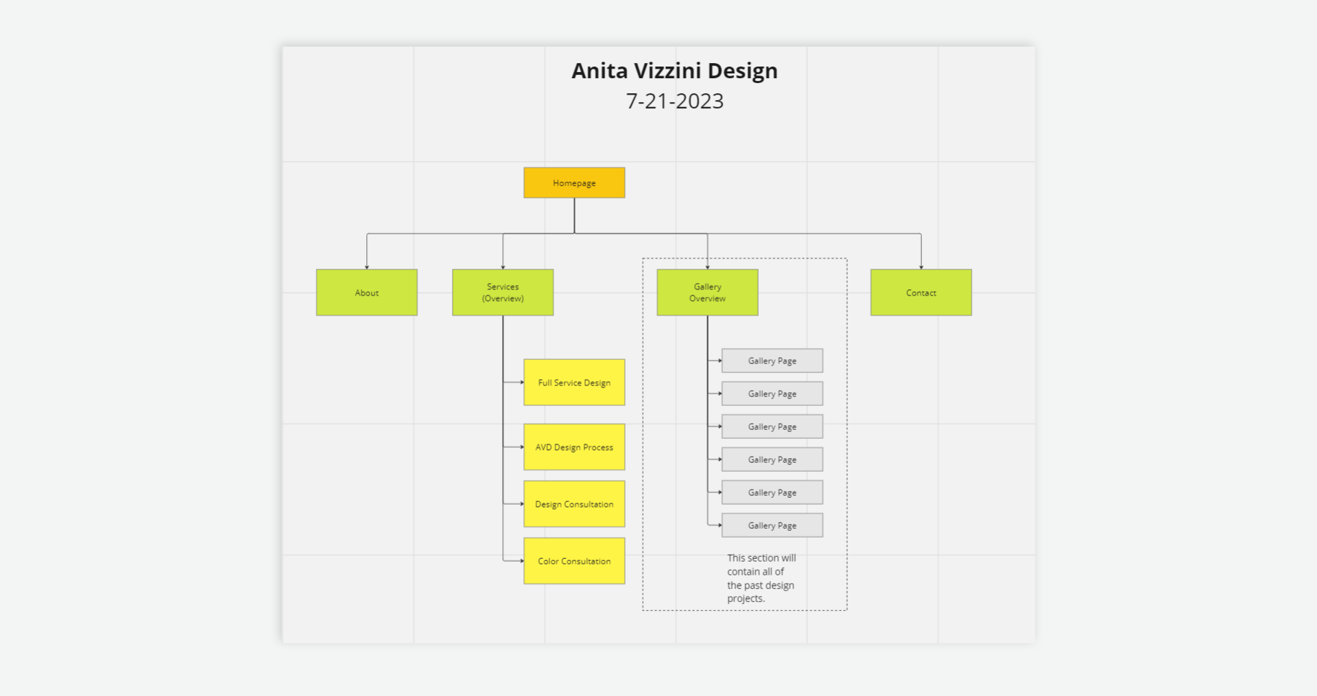
Revamped Site Map
One of the project requirements was to reduce the total number of web pages. After a card sorting exercise, web page totals decreased from 39 to 17. The previous number of pages hurt site visitors having too many pages of content to navigate. A simpler approach was needed to focus on the agency's main services. The main goal was to increase potential site visitors to contact the agency to inquire about interior design-related work.
Branding Revamp
The original logo for the agency was a sans serif font which was quite popular back in its era. The color palette used a variety of earthy browns with a contrasting mint color which was popular back in the past. To help modernize the brand, a serif font was used to give an agency identity a feeling of elegance and sophistication. The revised color palette was made up of neutral colors which would be less likely to compete against other elements on a page. It was important for images used in the site to pop out against a neutral background.

The Redesign
The previous version of the website looked dated while containing too much content. Since it was built in the late 2000s, the site wasn't developed to be responsive and ADA-compliant. The redesigned site was envisioned to include new branding guidelines using a neutral color pallet to allow the stock photography to stand out. There also was a budget to include online testing to help with the re-branding, navigation types, and template color selection. Another goal was to make sure the website would be in ADA compliance and developed to be fully responsive to work on desktop and mobile platforms.

Personas
Understanding the user's needs, experiences, behaviors, and goals was important. An in-depth analysis was conducted to review the behavior patterns, background information, skills, goals, and problems of a typical customer looking for interior design work. The Personas reflected primary visitors including middle-class males, females, parents, semi-retired or newly retired individuals, or couples who earned a sizable financial nest egg.

Navigation Types Research
Part of the research was to test the dropdown navigation type against a hamburger navigation menu type. One of the key differences between the two types of navigation is, that the Hamburger type would require more user clicks to accomplish the same task when compared to the dropdown navigation type. Another difference between the two types, was the dropdown version displays all the menu items while the hamburger type offers a cleaner look by revealing the menu items only when the user clicks on the hamburger icon.

Navigation Testing - Dropdown vs. Hamburger
Below is the testing demographics used for both first-click tests. Both tests will also include follow-up questions to allow the participants to explain their choices.

Dropdown Navigation Test Results
The results shown display a heat map made up of user first-click impressions. From the results, we can see which areas are receiving more clicks based on the size of the red areas. Seeing the time it took to complete each step helped determine how easy and effective the navigation type was.

Hamburger Navigation Test Results
Below are the results shown for first-click impressions. From the display of the hot spots on the images, we can see where most of the impressions are showing up. Between the two tests, the hamburger menu test took longer for an average user to complete the same task.

Dropdown vs. Hamburger Test Results
The overall test results show the Dropdown navigation type is overwhelmingly the clear winner. The results indicated there was a 94 percent probability the results were accurate. With the final results, it was decided to go ahead and use the Dropdown navigation concept for the redesign.

Color Preference Test
With the Dropdown navigation type being the clear winner, 2 different color schemes were tested next using Lyssna to run a preference test. From the results, Color Variation 1 was the clear winner of the two having a 93% confidence that the results are accurate.

Low-fidelity Page Templates
After the navigation and color tests, low-fidelity mockups were created for each main website page. Each mockup displays where the final copy will go and has a placeholder for images which would be inserted later. Once the first draft copy was inserted, the templates went through a Q&A process.

Final Hi-fidelity Page Templates
After the low-res approval process, hi-res templates were created to include finalized page content and images. The final hi-res templates were later used to develop the final HTML and CSS pages. The final designs looked more sophisticated and professional when compared to the original page designs. Hopefully, these final layouts will help convince a visitor to consider the agency's design services.

Conclusion
With the redesigned site now live, SEO services are being used to track the site traffic for the number of visitors and to see which pages are the most interesting to them.